

Let’s face it—most traders misunderstand chart patterns. Newbies often think they’ll spot perfect up-and-down waves, enter the trade, and walk away with predicted profits. Simple, right?
Well, not exactly. The market doesn’t create neat, perfect patterns. Instead, you’ll often see tops and bottoms that aren’t quite aligned or overall shapes that don’t look clean. Beginners typically write these off as “false” patterns.
But here’s the truth: chart patterns aren’t about perfectly aligned lines. They’re about understanding the story the market tells as the pattern forms. And most of the time, it’s just supply and demand playing tug-of-war. Predicting isn’t the goal—anticipating what might happen after spotting signals is.
In this post, we’ll explore Diamond and Dome patterns and how to deal with market uncertainty and imperfect shapes.
Table of Contents
The Round Top/Bottom Pattern
The Rounding Top Reversal Pattern, also known as the Dome Pattern, is a prime example of a pattern that may seem rough around the edges, but it definitely has its charm. While it might not be as clean-cut as other classic patterns, it still tells an important story.
As a reversal pattern, the Rounding Top appears at the end of an uptrend as momentum begins to slow down. Now, if you’ve seen other classic patterns in educational materials, you’ll notice they often show sharp pivot points and significant price swings. The Rounding Top, however, doesn’t follow this rule.
Like most bearish reversal patterns, the Rounding Top has a neckline support. If the price breaks this support after the dome forms, the pattern is confirmed. (Check out the provided image for a visual representation). The dome above the neckline is often depicted as a half-circle, but it almost never forms a perfect circle—there are usually some deformities. Despite this, as long as the core concept of the pattern holds, it’s valid.
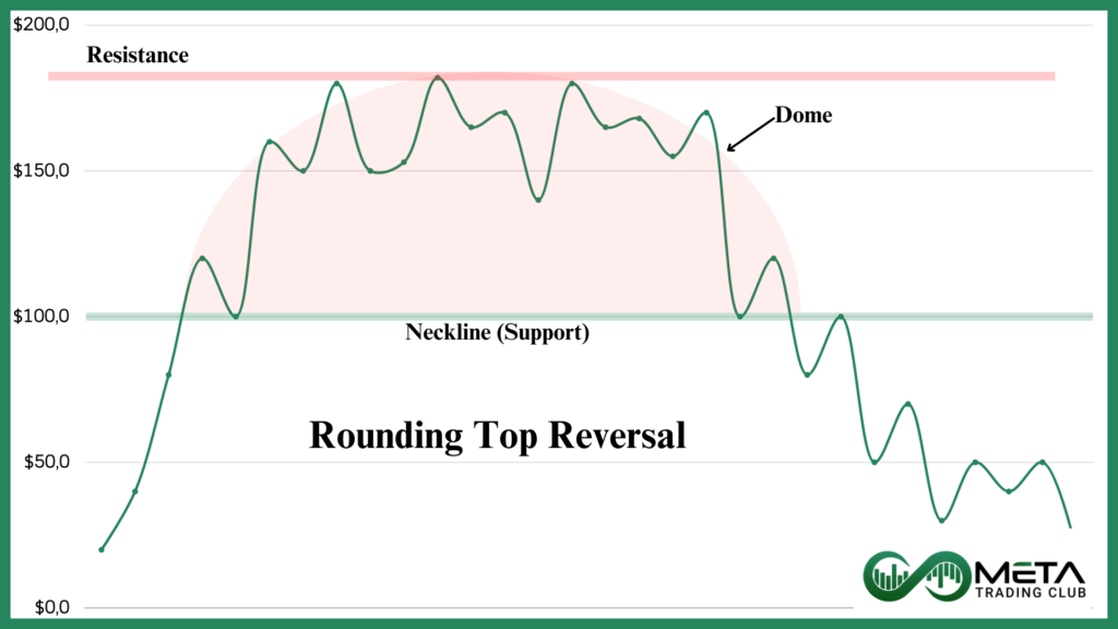
So, what’s the message behind the Rounding Top? The dome forms when the price gradually approaches a high supply zone. This causes a series of small ups and downs, moving from a high-demand area (the uptrend) to a more balanced zone (near the dome’s peak) before finally hitting a resistance level. Once the price reaches this resistance, it retraces along the same path, experiencing more small ups and downs before falling. This creates the dome shape. The pattern is confirmed when the price breaks the neckline support with increased momentum and trading volume.
As mentioned, the small fluctuations form the rounded top at the end of an uptrend. However, these fluctuations can sometimes have larger swings, creating an irregular pattern that looks less like a smooth dome and more like random peaks and troughs in a high-supply zone. Ironically, this “messiness” is actually what defines the pattern—the struggle at the high supply zone is what creates the dome.
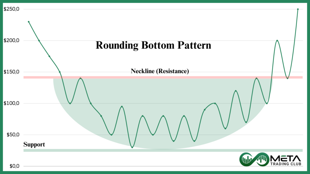
There’s also a bullish version of this pattern—the Rounding Bottom. It’s essentially the mirrored image of the Rounding Top, where the price moves from a low supply zone to a high demand zone.
Trading the Rounding Top/Bottom Pattern
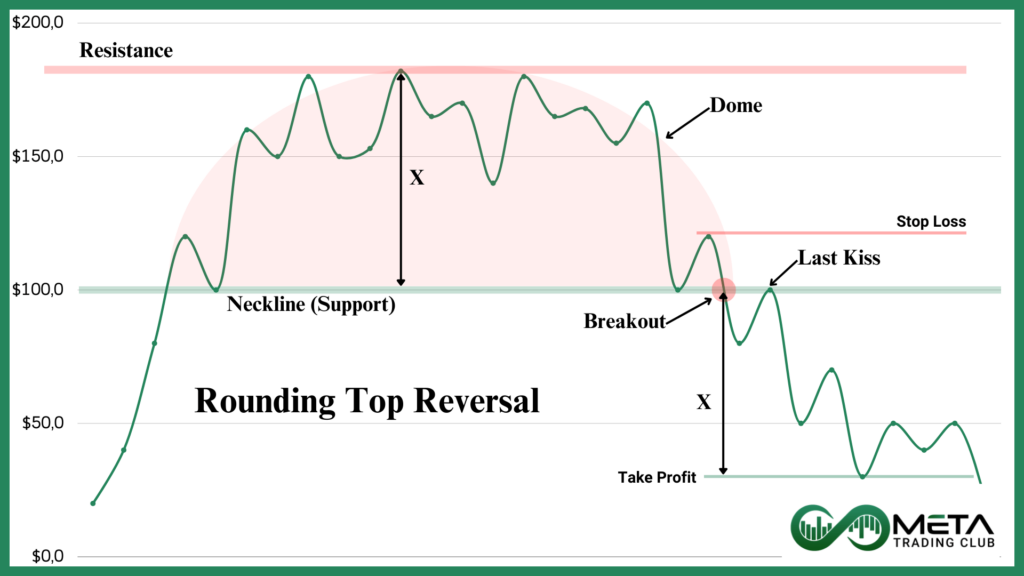
While identifying the Rounding Top/Bottom pattern might be challenging for some, trading it is much simpler. For the Rounding Top pattern, wait for the price to break below the neckline support and confirm the downward movement with bearish signals. These could be anything from bearish candlesticks to indicators showing negative momentum.
Once the breakout occurs, you can enter a short trade or wait for a “last kiss” of the broken neckline for a safer entry.
For take-profit targets, measure the price difference between the neckline support and the dome’s top resistance. This difference becomes your price target for taking profits. As for stop-loss, this is where your risk management strategy comes in. A common approach is to set the stop just above the dome’s top resistance. However, if that feels too far for comfort, you can opt for a stop above the last peak before the neckline breaks. The image bellow shows how to implement stop-loss and take-profit levels on the Rounding Top pattern.
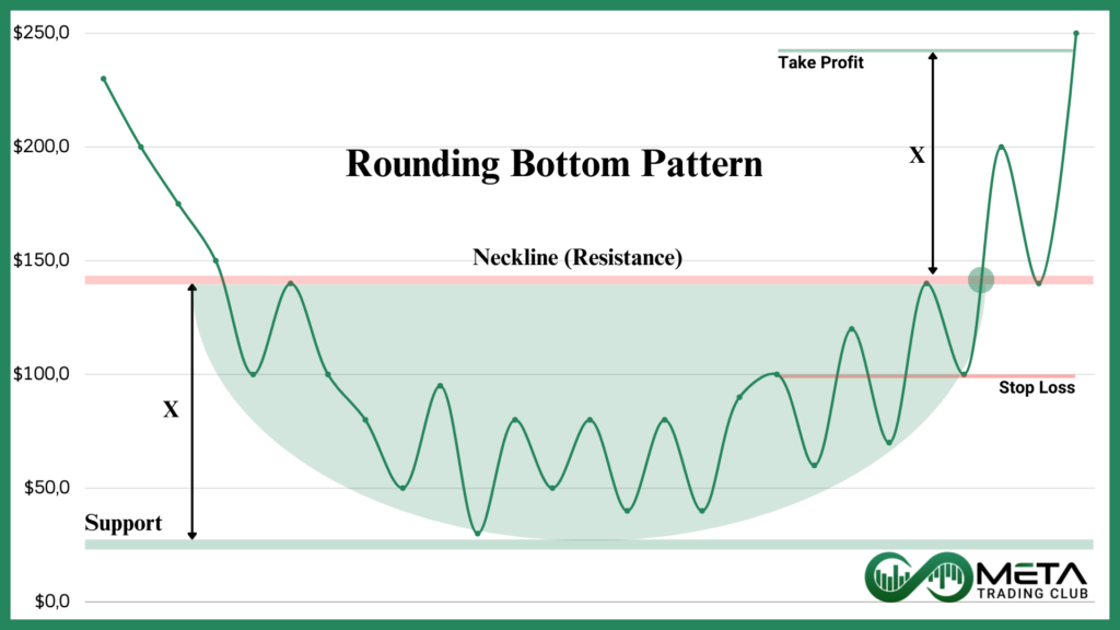
For the Rounding Bottom, the same principles apply, but inverted. Check out the provided image for a clearer picture.
Finally, even if the pattern is confirmed, there’s always a risk of failure. Make sure to use proper risk management techniques to avoid falling for any fakeouts.
The Diamond Pattern
The Diamond pattern is one of the most versatile and, frankly, puzzling patterns out there. Why? Because it challenges everything you know about chart patterns. The same structure—unchanged and unrotated—can be a bearish reversal, bearish continuation, bullish reversal, or bullish continuation. How is that possible? Can it even be considered a pattern? Well, yes!
But before we dive into how this works, let’s first look at the anatomy of the Diamond. The pattern consists of smaller peaks and valleys on both sides, with a major peak and valley in the middle. You can see an example in the image below:
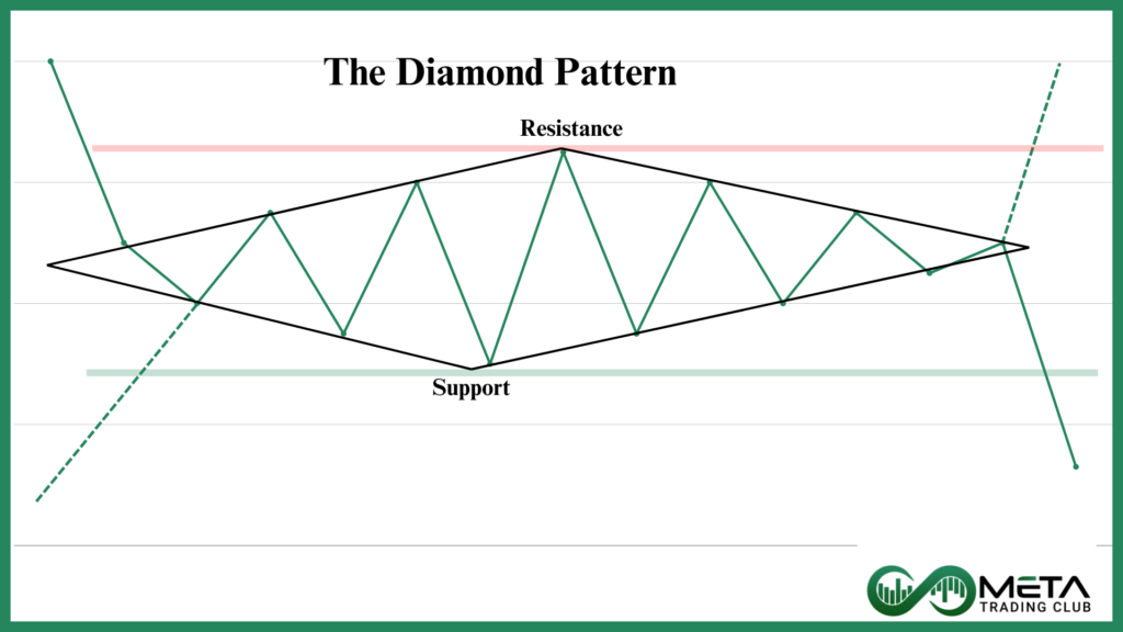
As mentioned, this structure can appear in four distinct scenarios. Depending on which side of the Diamond the price enters and exits, you get a different pattern. The point here is that you can’t predict with certainty which side will be the exit, so you need to watch and let the market unfold. Once the pattern reveals itself, you ride the wave and take your profits.
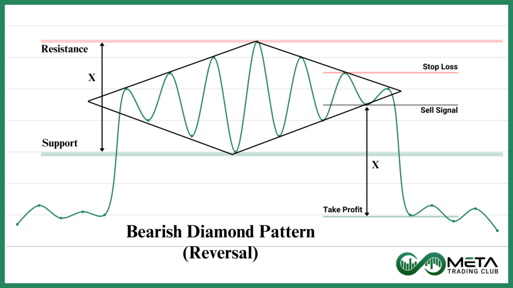
Bearish Diamond Reversal
The Bearish Diamond Reversal forms at the end of an uptrend, signaling a market reversal. The price enters from the lower left side and exits from the lower right side of the Diamond. If it falls below the last dip, the pattern is confirmed and could signal the start of a downtrend.
Check the image below for entry, take-profit, and stop-loss levels:
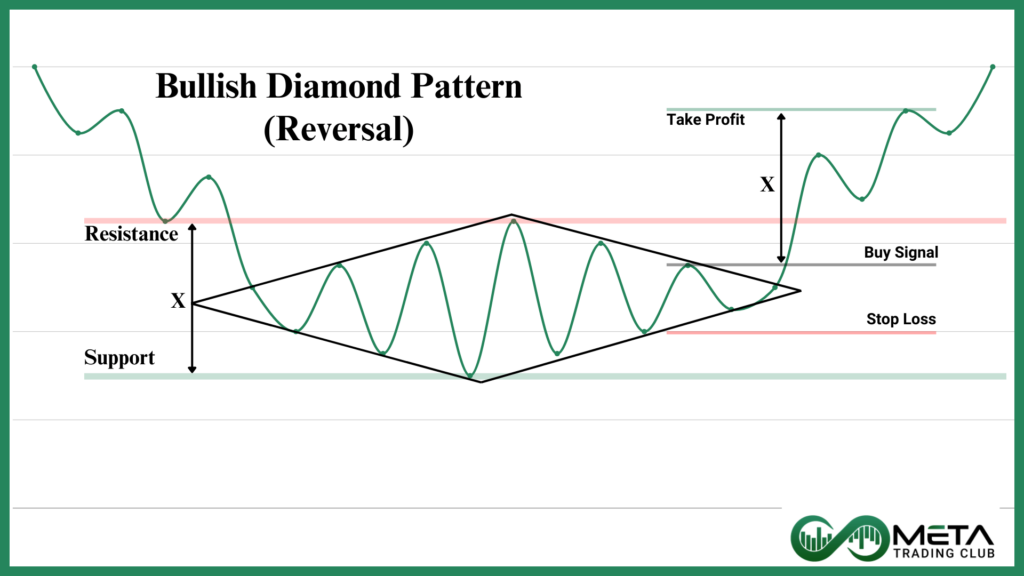
Bullish Diamond Reversal Pattern
In the case of a Bullish Diamond Reversal, the pattern appears at the end of a downtrend. The price enters from the upper left side and exits from the upper right side, indicating the beginning of a new uptrend. If the price exits the upper right side and surpasses the last peak inside the Diamond, it sends a buy signal. For the stop loss, place it below the last valley, and for take-profit, use the width of the Diamond. Check the image below for an example:
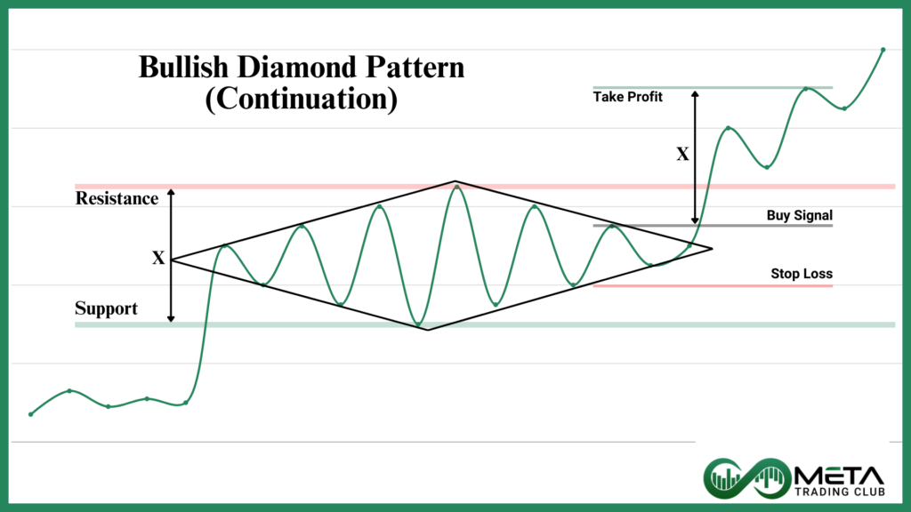
Bullish Diamond Continuation Pattern
As the name suggests, in the Bullish Diamond Continuation pattern, the price doesn’t reverse after exiting the Diamond—it continues in the same upward direction.
In the image below, you can see the price entering from the lower left and exiting from the upper right side. Suggested stop-loss and take-profit levels are also shown.
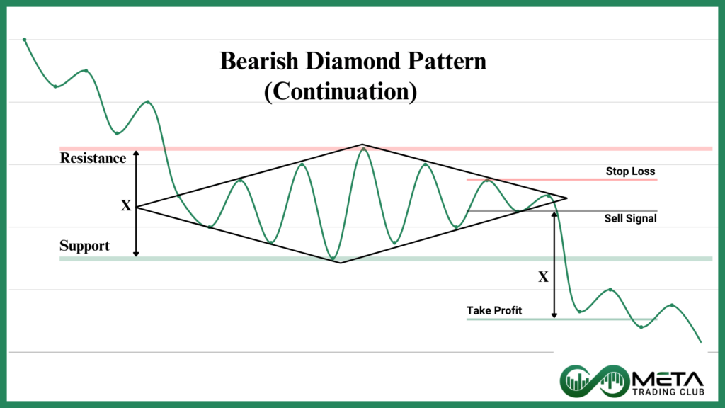
Bearish Diamond Continuation Pattern
This is the inverted version of the previous pattern. Here, the price enters from the upper left side of the Diamond and exits from the lower right side, continuing the downtrend. When the price drops below the last valley in the Diamond (and no, this is not a fancy real estate district in LA), it signals a sell. As with other patterns, the image below shows recommended stop-loss and take-profit levels:
Bottom Line
Today you’ve learned about two eye-opening chart patterns—the Rounding Top/Bottom and Diamond patterns—and explored how to identify and trade them. You’ve learned how to spot reversals and continuations, how to manage risk with take-profit and stop-loss levels, and most importantly, how to stay flexible as the market unfolds.
Now it’s time to put your knowledge to the test. Head over to a demo account and practice what you’ve learned. Journal your trades, reflect on your mistakes, and celebrate your successes. Use this as a tool to refine and optimize your strategy, so when you’re ready for real-money trading, you’re prepared to ride the waves with confidence.
Happy trading!
FAQ
The Rounding Top pattern is a bearish reversal signal that forms at the end of an uptrend, signaling potential price decline once the neckline support is broken. It’s characterized by gradual price fluctuations that create a dome shape.
To trade the Rounding Top, wait for the price to break below the neckline support and confirm with bearish signals like candlesticks or indicators. Enter a short trade or wait for a retest of the neckline for a safer entry. Set take-profit based on pattern width.
The Diamond pattern is a versatile chart pattern that can indicate a bullish or bearish reversal or continuation. It consists of peaks and valleys, and its direction depends on whether the price enters or exits from the upper or lower sides of the Diamond.
To spot the Diamond pattern, look for a series of smaller peaks and valleys forming a diamond shape, with a major peak and valley in the middle. The pattern can signal a market reversal or continuation depending on the entry and exit direction.
The Diamond pattern can be a Bullish Reversal, Bearish Reversal, Bullish Continuation, or Bearish Continuation. Each type depends on the direction the price enters and exits the pattern. Understanding this distinction helps traders identify potential trends and make informed decisions.